Yesterday, I showed you some graphic samples for planning my next weaving project. Your feedback was very helpful and got me thinking. Valerie mentioned the large solid areas and suggested swapping color order to avoid them. So, I experimented in WeaveDesign. All of them can be enlarged by clicking. As a side note, I have no idea about the cross hatching in the solid areas. Quirky things happened between WeaveDesign, Gimp, and Blogger. They look better when enlarged.
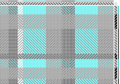 |
| First I tried swapping the medium gray warp for turquoise. |
Definitely more interesting. Then I thought, well, the turquoise is just supposed to be an accent color. What if I swapped something else?
 |
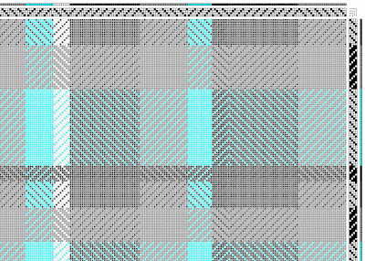
| Next I tried swapping the medium gray for light gray in the warp. |
 |
| Then I tried swapping the medium gray for turquoise in the weft. |
The thing is, preferences are all so subjective. Next, I definitely need to do some sampling on the loom.


4 comments:
Leigh, either of the last two catch my eye.
TB, me too, thanks!
This is a great journal-- it's neat to see all the planning. Personally, I like the first swap (second photo) the best, but if it needs to be more muted, then I like the second swap (third photo). I definitely agree that preferences are subjective!
CM, hello and welcome! Thank you so much for your kind words about my blog. And thank you for the feedback on the samples. I agree with you about that first color swap; it's definitely the one I'm favoring. I'm curious to see how they weave up as samples.
Post a Comment