Now, here's what I want to show you......
 This is my second rug in polychrome, using the same threading as the first one. It measures 19 by 31 inches, plus 3 inch fringes on either end. Of course, I was silly enough to ignore the wise advice I have heard repeatedly, "Always put on more warp than you think you'll use," and had to tie on more to weave this one.
Marie asked about the rug filler I used. Yes, it does look like mop cotton!
 Now, I did not purchase this, it came from the weaver from whom I bought my loom, who included all her weaving yarns too. I suspect the wrapper is exceptionally out of date; indeed, I wouldn't even know where to get this stuff.
 It is a 4 ply worsted weight cotton yarn, similar to the sugar & cream type crochet cottons. It measures 12 WPI (if one thinks like a spinner) or 750 yards per pound (if one thinks like a weaver).
It does not make for an especially thick, nor sturdy floor rug. It would probably do best in low traffic areas or as a run-and-slide cat toy across a hardwood floor. I think it would be better suited for heavy blankets, or a throw across the back of a chair than for the floor. But what the heck, I just used what I had. In fact, I would never have purchased this color combination, I just challenged myself to use what I had. It took quite a bit of experimenting to come up with a color scheme that I liked, but once I got weaving, the spring-like Easter colors grew on me.
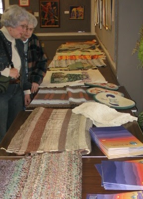
I took both my little rugs to the monthly WNCF/H Guild meeting where, in preparation for the program on rug hooking, the show-and-tell theme was "rugs."

 Quite a few gorgeous rugs to admire, as you can see. Lots of good ideas to tuck away for future use. I can't say that I see myself as a rug weaver, but I do like the idea of creating items which are both useful and functional. So ........ maybe someday ........
© 2007 Leigh's Fiber Journal
Related Posts:
Summer & Winter: Polychrome Rug 1
Summer & Winter: Structure and Theory
My Fascination with Fibonacci
Gallery Photos: Rugs
5 comments:
Hi Leigh! Well, I use Safari and also checked in Netscape and the blue line is in its proper place. I used to have problems with Explorer with my Blogger blog at times. Boo hiss.....
But it looks great from here!
Hi Leigh, I use IE7 and the line is definitely intersecting your banner.
It looks good to me but I also use Foxfire.
OK. I've found a tweak to correct this problem and given it a try. Here's hoping it works!
It works now. Last night it was still looking wrong, but is perfect now. O!
Post a Comment